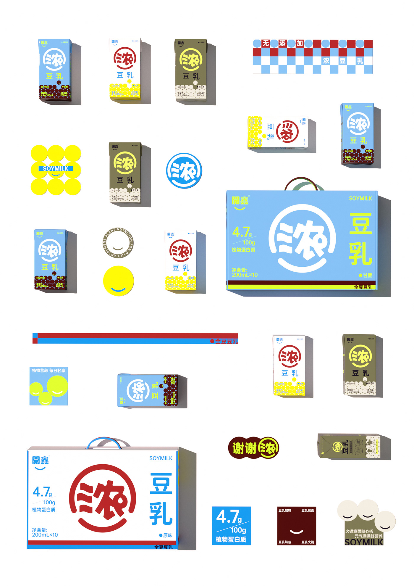
We started from the demand point of packaging design and carried out a new packaging upgrade for this Kaixin thick soy milk.
01 To establish a brand, you must first establish a super symbol
Products are flowing, symbols are eternal The meaning of super symbols lies in the graphic expression of brand value.
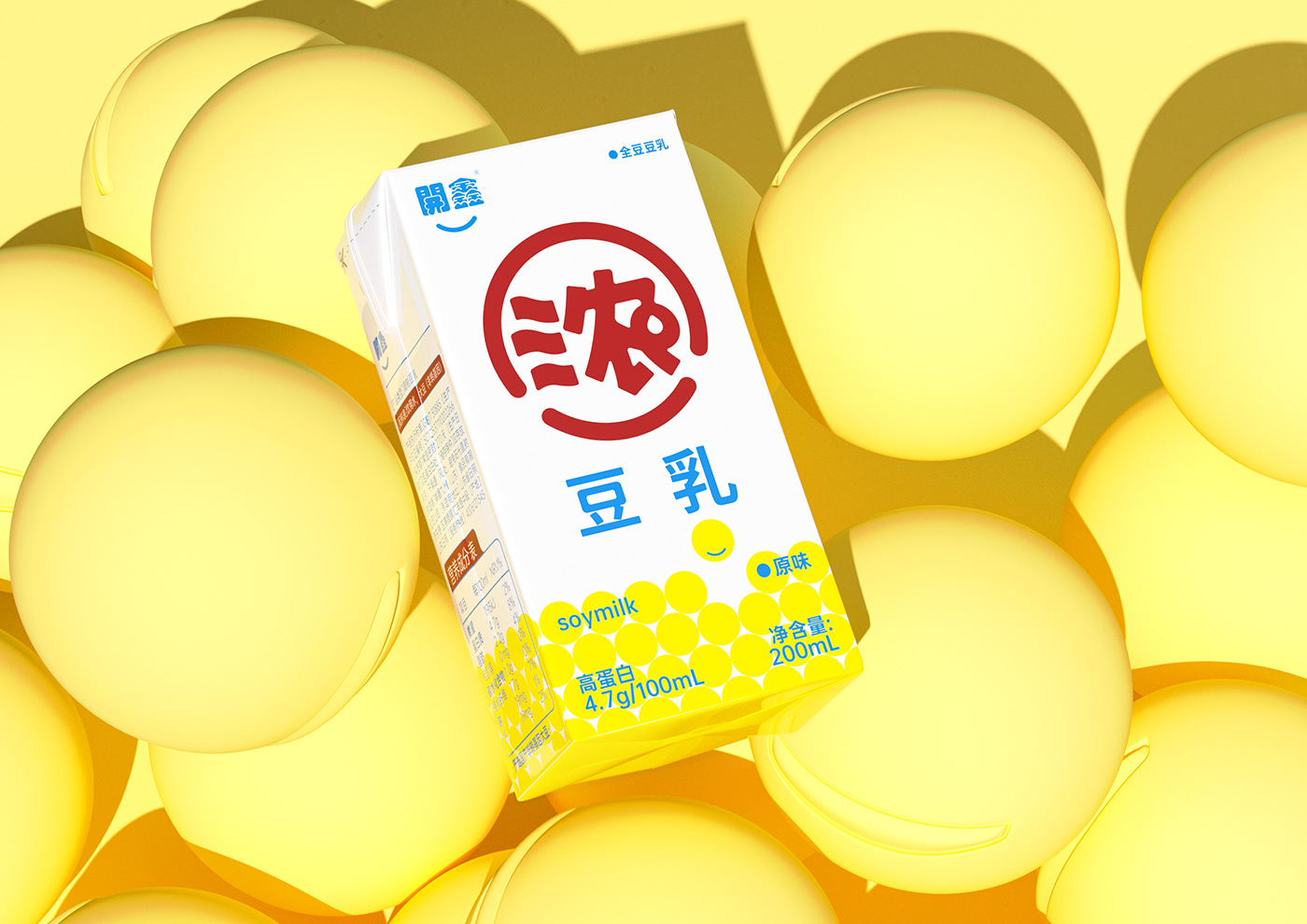
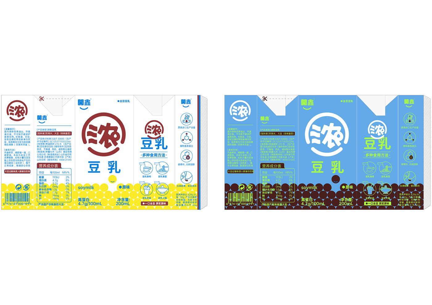
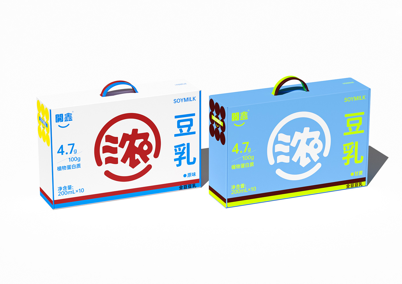
The coverage of soy milk in the daily ready-to-drink consumer market is not rare, but many people claim that their selling points are “low sugar”, “zero sugar” and “plant milk”. When the selling points tend to be consistent, it is necessary to reshape the category perception. Kaixin Concentrated Soy Milk itself has unique product selling points, and all we need to do is to amplify its selling points infinitely. Establish the category recognition of Kaixin’s “thick” soymilk. Extracting the brand's core selling point "concentration" and creating a super symbol is the core design point of this brand expression.
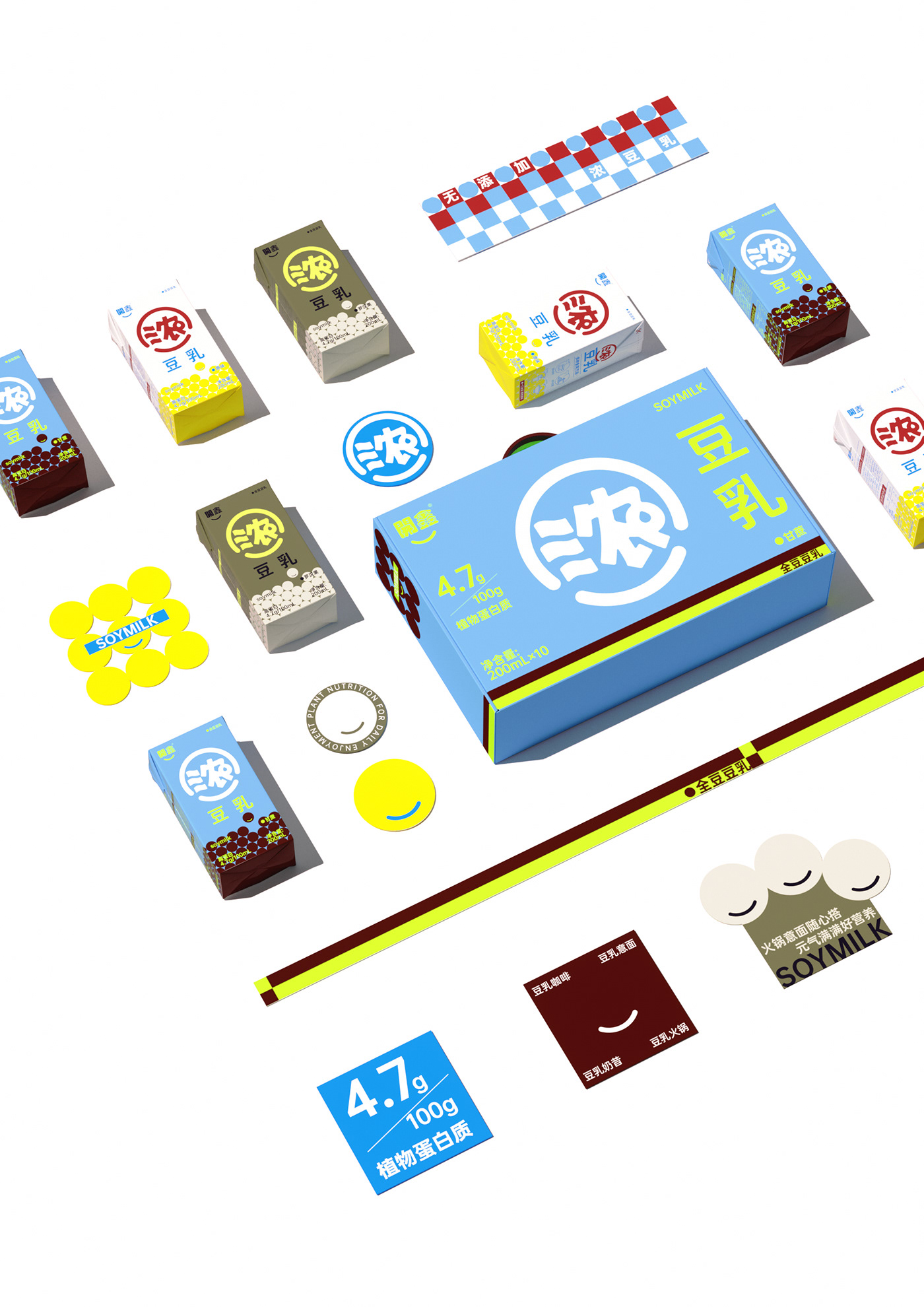
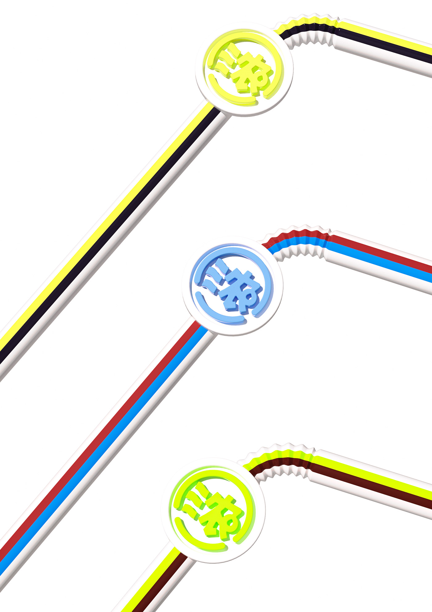
The "thick" graphic is extracted from the smiley face symbol of the brand logo "Kaixin" and isomorphically formed by combining the pictographic water droplets of thick soy milk. It not only retains the brand but also has iconic identity.
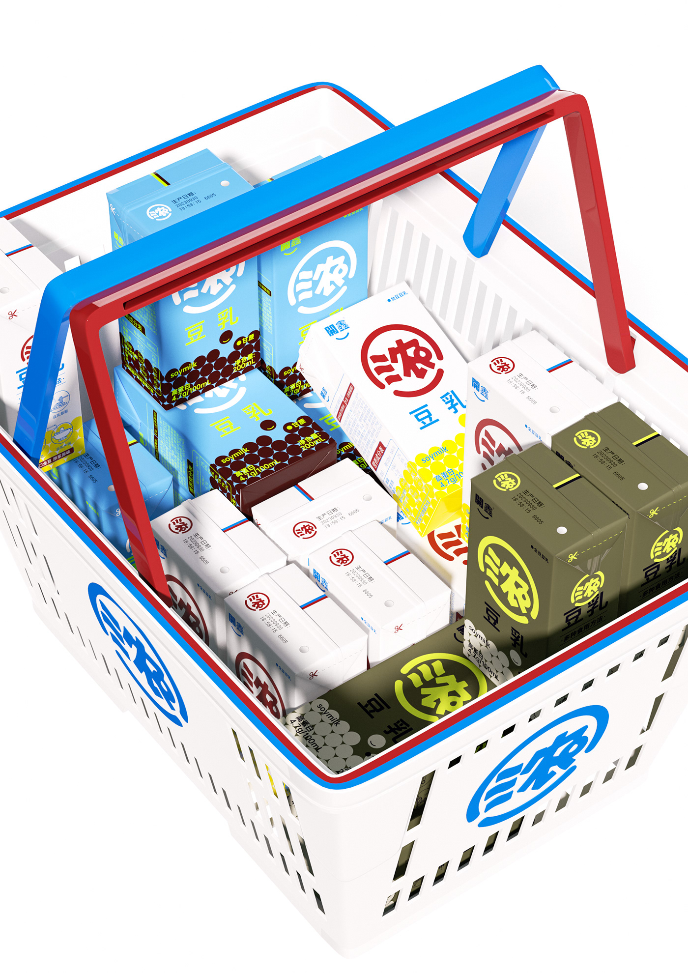
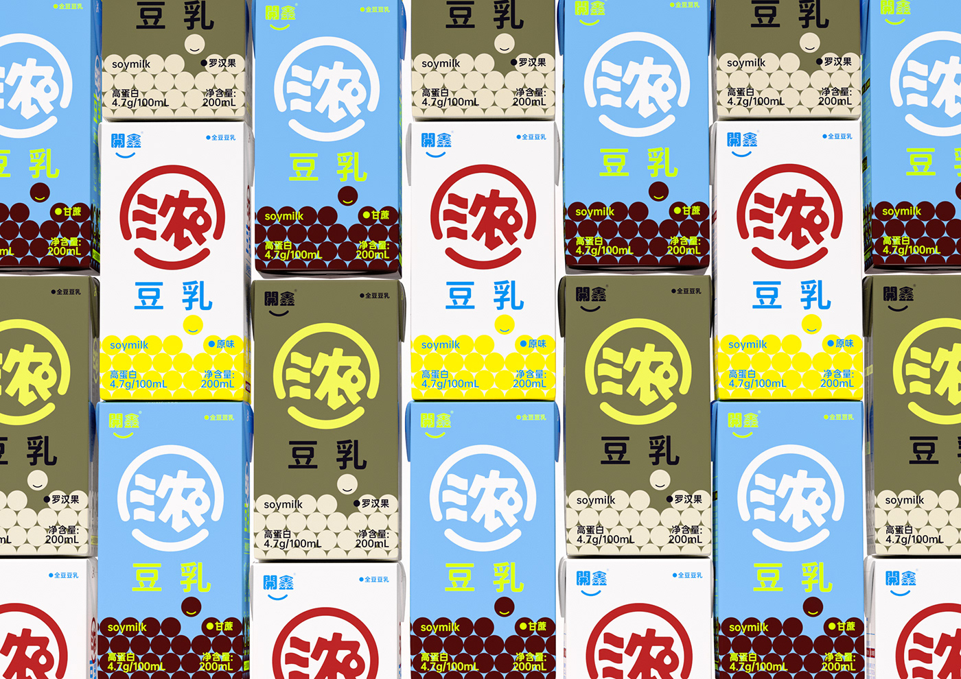
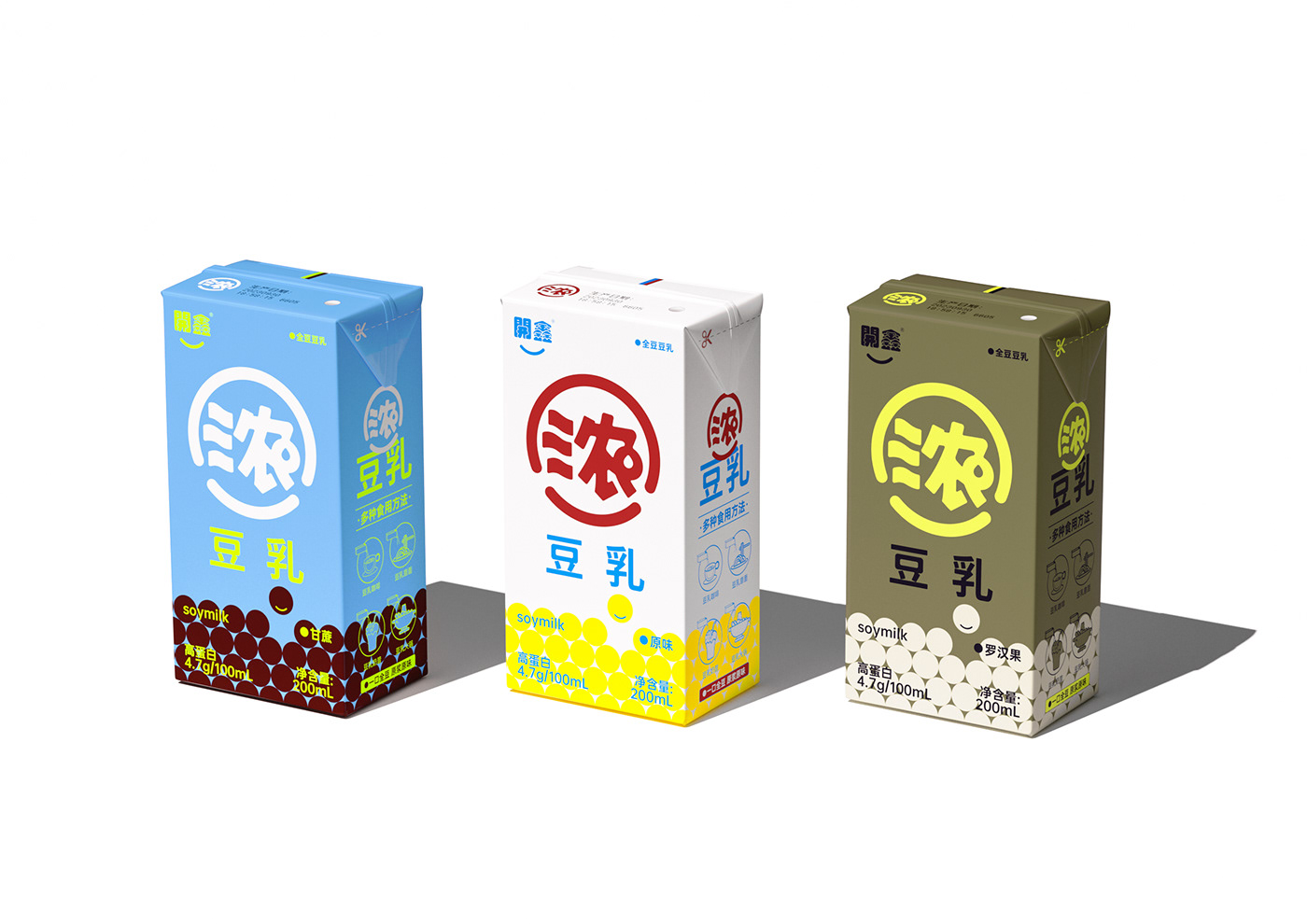
The super symbol is maximized on the front of the package, and the brand's selling points are maximized, which enhances the product's shelf advantage and sense of array, and significantly differentiates it from similar products.
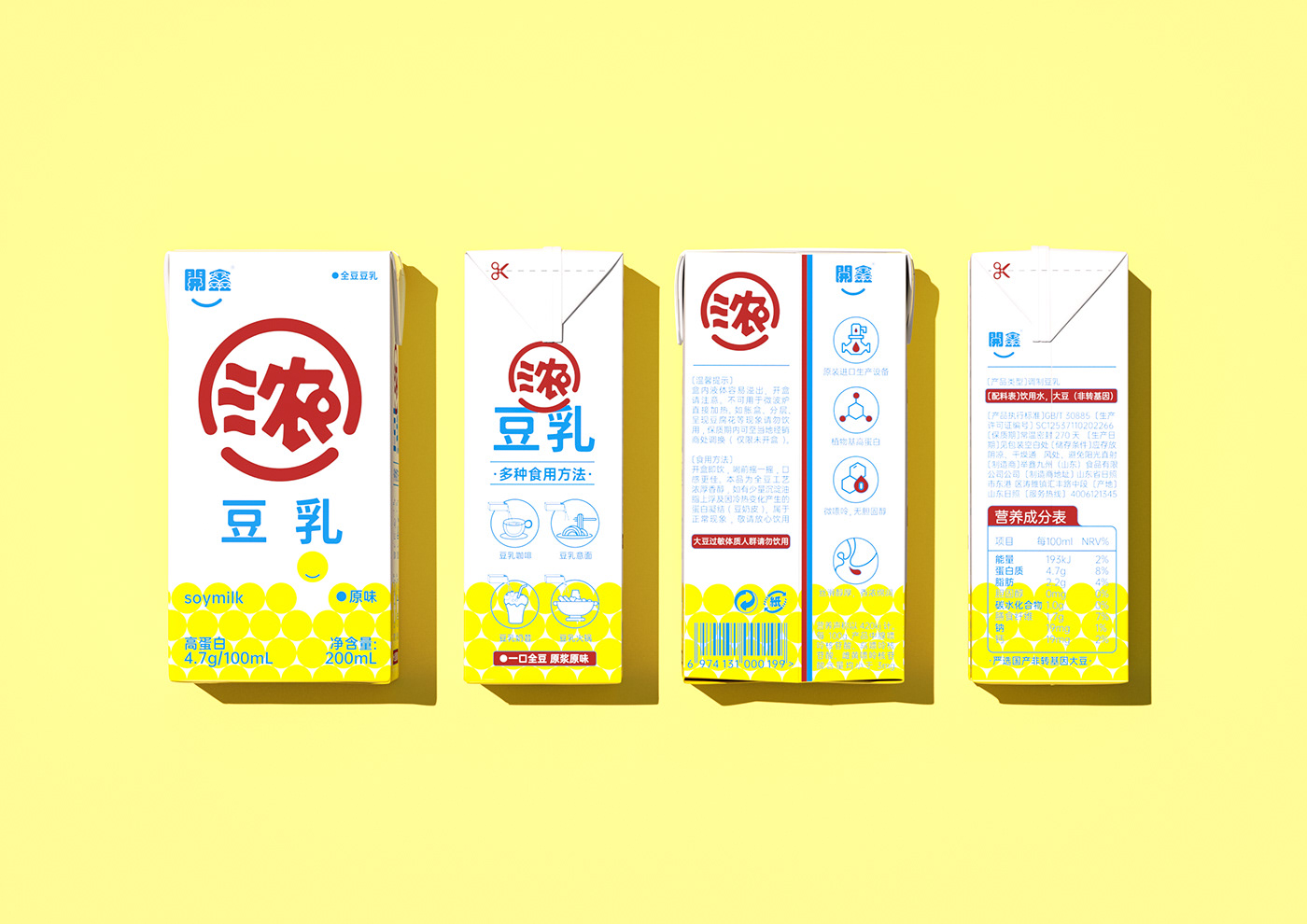
02Packaging logic has clear priorities:
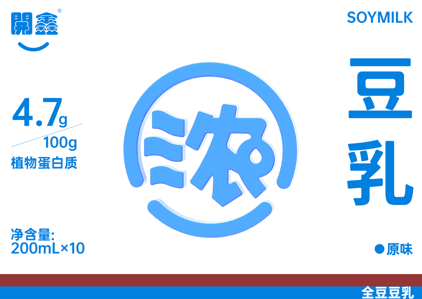
The first visual link between the brand and the selling point of the super symbol,
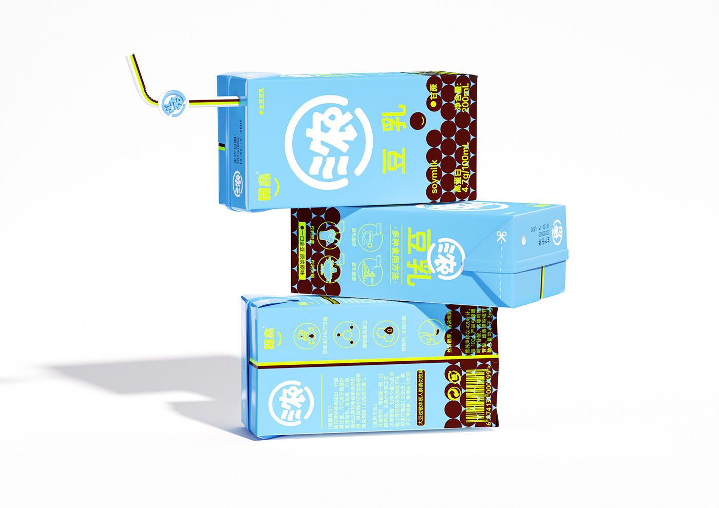
Second visual category and taste differentiation
Third vision brand logo
03 Product positioning and tonality:
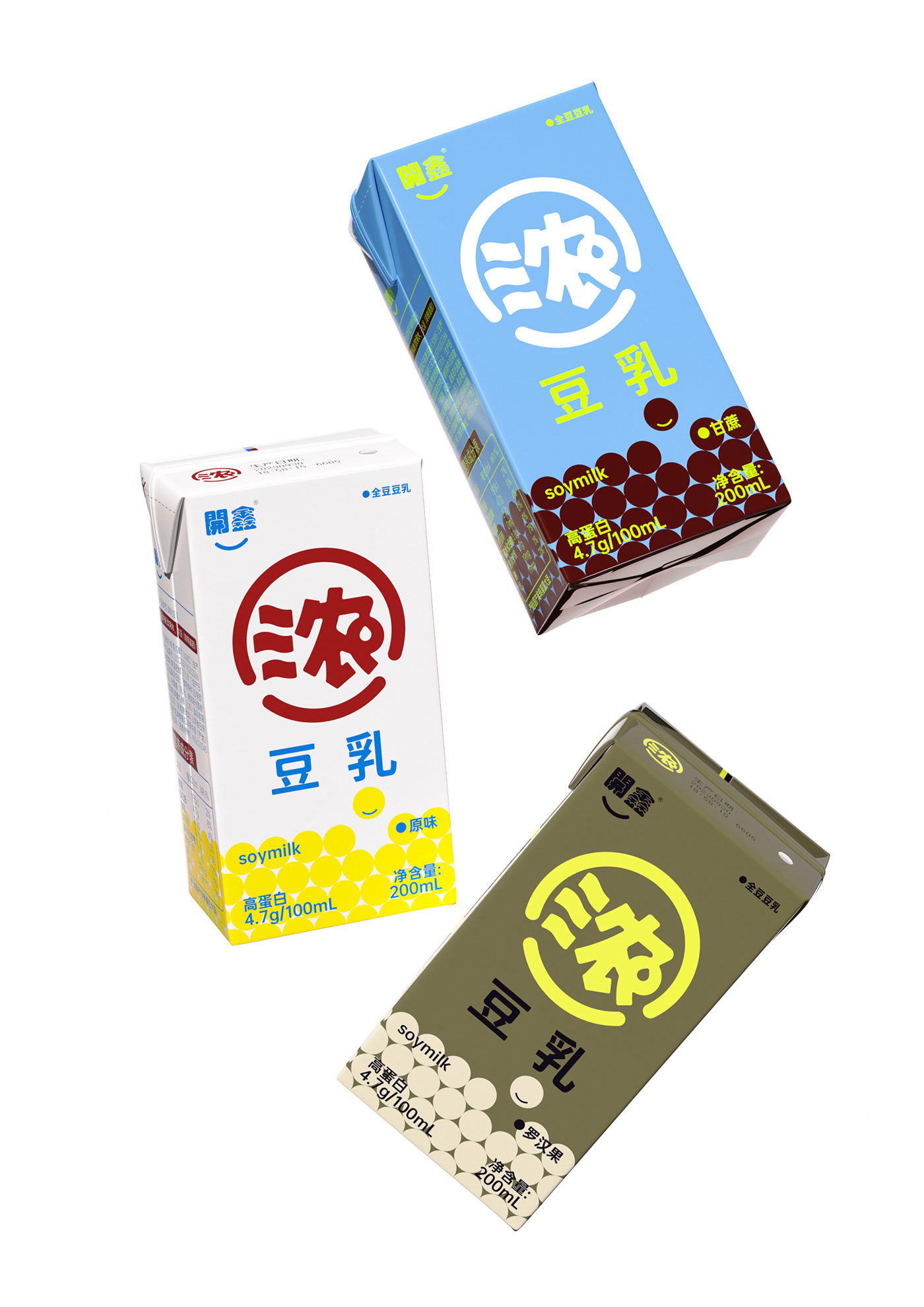
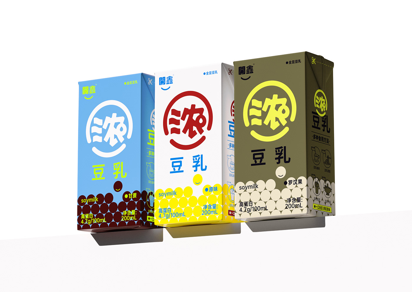
The target groups of thick soymilk are wide-ranging: people who pay attention to healthy diet, children, pregnant women, teenagers and the elderly. This requires us to consider the compatibility of the design. We take all target groups into consideration and make it simple, fashionable and compatible. The harmonious design tone satisfies the public's aesthetics and does not favor a certain group of people.
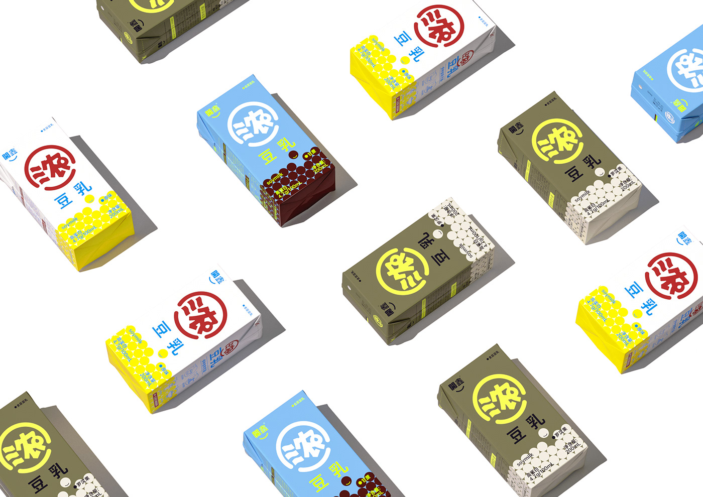
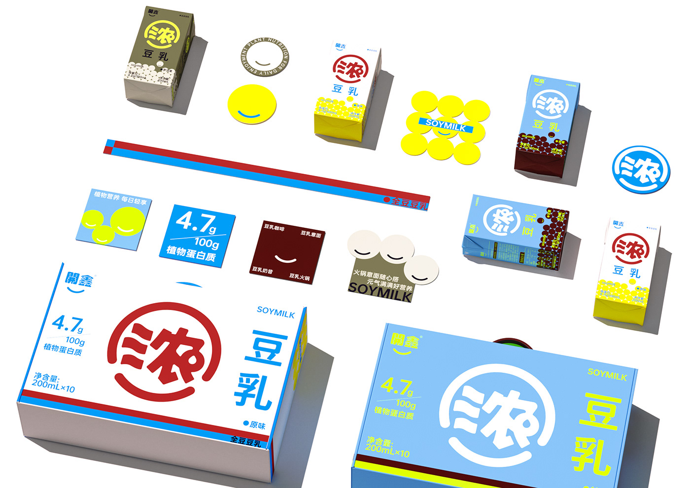
04Application packaging system:
Our upgrade this time is based on the long-term development of the brand.
A brand new upgrade was made and the packaging system framework was systematically standardized. Super symbols and plate designs can be standardized and extended from SKUs to facilitate the extension and development of new product lines in the future.
01 To establish a brand, you must first establish a super symbol
Products are flowing, symbols are eternal The meaning of super symbols lies in the graphic expression of brand value.
The coverage of soy milk in the daily ready-to-drink consumer market is not rare, but many people claim that their selling points are “low sugar”, “zero sugar” and “plant milk”. When the selling points tend to be consistent, it is necessary to reshape the category perception. Kaixin Concentrated Soy Milk itself has unique product selling points, and all we need to do is to amplify its selling points infinitely. Establish the category recognition of Kaixin’s “thick” soymilk. Extracting the brand's core selling point "concentration" and creating a super symbol is the core design point of this brand expression.
The "thick" graphic is extracted from the smiley face symbol of the brand logo "Kaixin" and isomorphically formed by combining the pictographic water droplets of thick soy milk. It not only retains the brand but also has iconic identity.
The super symbol is maximized on the front of the package, and the brand's selling points are maximized, which enhances the product's shelf advantage and sense of array, and significantly differentiates it from similar products.
02Packaging logic has clear priorities:
The first visual link between the brand and the selling point of the super symbol,
Second visual category and taste differentiation
Third vision brand logo
03 Product positioning and tonality:
The target groups of thick soymilk are wide-ranging: people who pay attention to healthy diet, children, pregnant women, teenagers and the elderly. This requires us to consider the compatibility of the design. We take all target groups into consideration and make it simple, fashionable and compatible. The harmonious design tone satisfies the public's aesthetics and does not favor a certain group of people.
04Application packaging system:
Our upgrade this time is based on the long-term development of the brand.
A brand new upgrade was made and the packaging system framework was systematically standardized. Super symbols and plate designs can be standardized and extended from SKUs to facilitate the extension and development of new product lines in the future.
我们从包装设计的需求点出发,对本次開鑫浓豆乳进行全新包装升级
01建立品牌首先要建立超级符号
产品是流水的,符号是永恒的
超级符号的意义在于品牌价值的图像化表达。
豆乳在日常即饮消费市场的覆盖率并不稀少,但卖点以“低糖”、“0糖”“植物奶”自居者多,卖点趋于一致的情况下,需要重塑品类认知。開鑫浓豆乳本身是有独特的产品卖点的,我们所需要做的就是将其卖点无限放大。建立開鑫“浓”豆乳的品类认知。提炼出品牌核心卖点“浓”进行超级符号打造是本次品牌性表达的核心设计点。
“浓”的图形从品牌logo“開鑫”的笑脸符号中提炼出来,结合浓豆奶的象形水滴同构而成。既保留品牌性同时具有象形识别。超级符号在包装正面最大化,品牌卖点最大化呈现,提升了产品的货架优势和阵列感,与同类产品做出显著区分,无论是线下终端货架还是新媒体都能一眼被发现,让包装自己完成销售。
02包装逻辑主次分明:
第一视觉关联品牌与卖点的超级符号,第二视觉品类及口味区分,第三视觉品牌logo
03产品定位与调性:
浓豆乳的目标人群定位是大跨度的:注重饮食健康的人群、儿童、孕妇、中青少年以及老人,这需要我们考虑设计的兼容性,我们把所有目标人群都考虑进来,做到简约时尚、兼容和谐的设计调性来满足大众审美,并不偏向某一种人群。
04应用性包装系统:
我们本次升级从品牌长远发展的考虑出发。
做了一次品牌的全新升级,将包装系统框架进行了系统的规范示意。超级符号与板式设计可以从sku上进行规范延展,以便于后期新产品线的延展与開发。
用超级符号重新定义品牌价值,用包装设计降低营销成本,用设计赋予包装更大价值。